Responsive Design: One Site, Every Screen
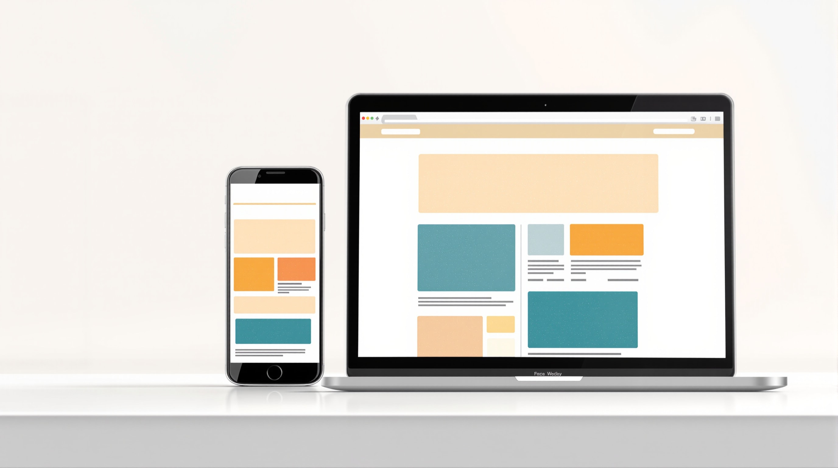
Your visitors are on phones, tablets, laptops, and large monitors — often the same person across a single week. Responsive design means building one website that reshapes itself to fit whatever screen it lands on, instead of trapping mobile visitors in a cramped, pinch-and-zoom version of a desktop page.
Why mobile comes first
For most small businesses, the majority of visits now come from a phone. That single fact reorders your priorities: the mobile experience is not a scaled-down courtesy, it is the main event. Designing "mobile-first" means starting with the small screen — deciding what truly must be there when space is tight — and then adding refinements as the screen grows, rather than the reverse.
This discipline is healthy even for the desktop version. When you decide what belongs on a phone, you are forced to separate the essential from the merely nice, and the whole site gets clearer as a result.
How responsive layouts actually work
Under the hood, responsive sites use flexible layouts that stretch and stack, images that scale to their container, and breakpoints — the screen widths at which the layout rearranges. A three-column row on a laptop becomes a single stacked column on a phone; a horizontal menu collapses behind a familiar menu icon. You do not need to understand the code to hold a designer to the outcome: at every common width, the page should be readable and usable without horizontal scrolling.
The MDN Web Docs maintain an approachable technical explanation if you want to see how it is built. For most owners, the key is simply to insist that responsiveness is a requirement, not an upgrade.
Design for touch, not just for small
A phone is not merely a small desktop; it is operated by a thumb. Tap targets — buttons and links — need to be large enough to hit reliably and spaced so people do not fire the wrong one. Menus, forms, and buttons that feel effortless with a mouse can be fiddly on glass, so they deserve their own test.
Watch out for anything that depends on hovering, since there is no hover on a touchscreen. If information only appears when a cursor rests on an element, phone users never see it. Make important content visible outright.
Keep it fast on a real connection
Mobile visitors are often on slower or patchier connections and less patient than someone at a desk. Heavy images and bloated scripts hurt them most. Optimise and correctly size images so a phone is not forced to download a picture built for a large monitor — a topic we cover in images for the web — and keep the page lean. Google has confirmed it predominantly uses the mobile version of your site for indexing and ranking, so a slow or broken mobile experience is also an SEO problem.
Test on actual devices
Resizing your desktop browser window is a useful first check, but it is not the same as holding a real phone. Borrow a couple of different handsets, or use your own, and walk through the important journeys: read the home page, find your contact details, complete the form. Problems that are invisible on a big screen — a button pushed off the edge, text too small to read, a form field that will not scroll into view — show up immediately on the device your customers actually use.
One site, well made, everywhere
Responsive design is no longer a premium extra; it is the baseline expectation of a competent modern website. Get it right and you serve every visitor well from a single site you only have to maintain once. Next, make sure that site works for people of all abilities in the accessibility chapter.